In April 1943, Satyajit Ray joined a British-run advertising agency, D.J. Keymer, as a junior visualiser. He spend next 13 years here, until he became a full-time filmmaker after success of Pather Panchali.
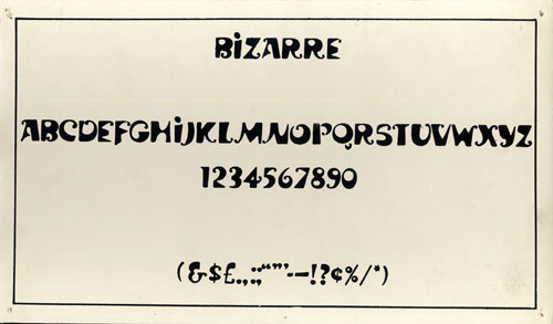
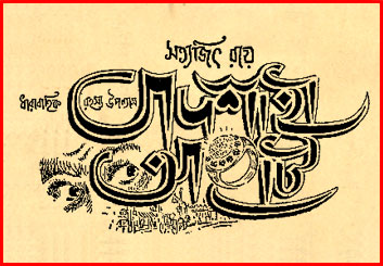
Ray was fascinated by typography both Bengali and English and produced many innovative advertising campaigns. His designs of two typefaces ‘Ray Roman’ and ‘Ray Bizarre’ would win an international competition in 1971.
He brought in more of Indian motifs and calligraphic elements to advertising. Later, his love for typography and illustration would often surface in the credits and the publicity posters of his films.
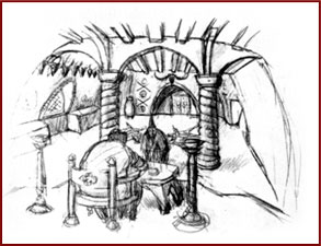
His senior colleague at D.J. Keymer, D. K. Gupta started a publishing house ‘Signet Press’ and Ray was roped in to do the cover jackets. In 1944, D. K. Gupta decided to bring out an abridged version of a novel by Bibhuti Bhushan Banerjee, Pather Panchali. Until then, Ray had not read much Bengali literature. By his own admission, he was even unfamiliar with the bulk of Tagore’s writings. Ray was asked to illustrate the abridged version of the novel. The book itself made a lasting impression. D.K. Gupta, a former editor of a Bengali film magazine, remarked to Ray that the abridged version of the book would make a very good film.
Signet Press also published two books of Satyajit Ray’s father Sukumar Ray; Abol-Tabol (Hocus-Pocus) and Ha-ja-ba-ra-la (Higgledy Pigleddy).
This long association with D. K. Gupta’s Signet Press for designing covers and illustrations for books also provided Satyajit Ray with an opportunity to read Bengali literature. Some of the books, he designed the jackets for, would later be adapted by him for films.
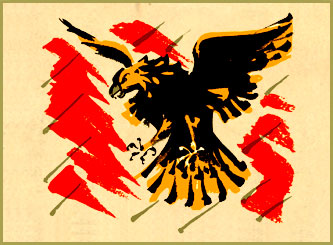
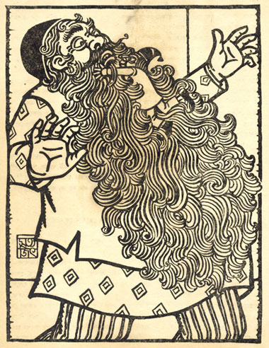
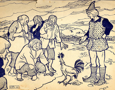
Ray illustrated a primer in Bengali. The flying eagle is done in bold brush strokes. 1943